I recently picked up Cat Seto’s Impressions of Paris: An Artist’s Sketchbook (Harper Design, 2017) and was absolutely transfixed. Though I’ve been to Paris, seeing the city through her illustrations and words instantly made me want to return. Cat Seto is a San Francisco-based artist, author, and founder/creative director of Ferme à Papier. She received her BFA in fine arts/painting and her MFA in creative writing/fiction from the University of Michigan. She is also the co-author of Mom, Inc.: The Essential Guide to Running a Success Business Close to Home (Chronicle Books, 2012). She has been published in anthologies and publications such as Best New American Voices, TriQuarterly, Glimmer Train, Nimrod, and Asian Pacific American Journal.
Seto’s paper goods collection, Ferme à Paper, was inspired by her first visit to Paris. The stationery line has since been featured by The New York Times, Vogue, In Style, Elle Décor, Real Simple, Lonny, Design Sponge, and Refinery 29. In 2015, Seto created a stationery gift line with Chronicle Books called Joie du Jour. Her illustrated collections can now found in more than five hundred stores, museum shops, and bookstores in the U.S. and internationally, including the Metropolitan Museum of Art, MOCA, SFMOMA, Anthropologie, and Paper Source.
When you took the trip to Paris, did you have any idea that you’d end up creating Impressions of Paris?
I took my first trip to Paris at forty, which, according to my design colleagues was gauche and terribly late in life for an artist. I was at a point in my design career in which the aesthetic of my wedding and invitation designs did not feel relevant anymore. I started to sketch new designs to add to my brand, but they felt like inauthentic and trendy stabs in the dark. Rather last minute, I decided to leave my business woes behind and clear my head by taking a trip to Paris. It was first trip out of the country for me in a over a decade. I prepared by loading up a dessert app by David Lebowitz and created an exhausting spreadsheet of patisseries, shops, and sights that I needed to hit.
 I can’t describe the feeling I had when I awoke in the taxi as it entered into the city. I was awed by the proportions, architectural details, the beautiful shop facades glowing at night. Little did i know that my color palette would completely change by the time I came back to San Francisco to my studio. It went from pops of color and pastels to dark, moody, academic navy and cobalts. I began sketching obsessively and over fifty-two images emerged within three weeks. I had to re-brand completely and started a new stationery goods line, Ferme à Papier, which took on hipsters, and a Paris + Brooklyn vibe. I never expected Paris would ignite a new brand and collaborations for me upon my return. And certainly, I never would have imagined when I was ordering passion fruit caramels at Jacques Genin, or cooing at the Mini at Merci that I would be ultimately illustrating and writing them for a book.
In the book, you mention your son. How did he inform the work?
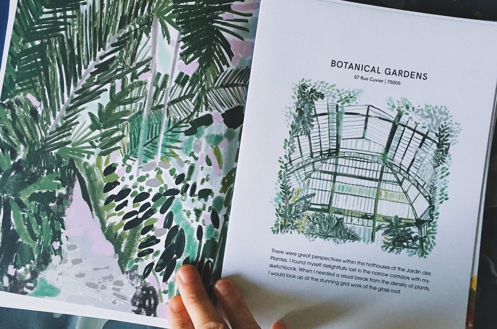
My son did not come with me to Paris which was something that often made my trips bittersweet. On my last trip, three days in, I started missing him terribly. So much so, I invited myself into a sketching circle of seven-year-olds at the Jardin des Plantes. When I relayed this to him, he decided to sketch me in those gardens and entitled it: “Portrait of Mom in the Botanical Gardens.” My editor was kind enough to include his drawing alongside my dedication, For the City of Light, and for Nolan, the Light of My Center.
My desire to want to share everything with my son appears in a few pages of my book. In the lovely book cafe inside of the Merci concept shop, I once spied an intimate table which overlooked the courtyard. To my dismay a couple lingered there and I was relegated to sit in the front of cafe. But in the illustration I sketched my son and I seated there, holding court as if this were a daily ritual with his sketchbook and a cup of coffee.
Are there any sketches that you did for the book that didn’t make it into the final version?
I had a tight window of time in which to process, sketch, and write the book. I needed at least 176 pages of illustrations so not much was wasted. But there are many sketches in the book that were painfully revised. In the sketch of the exhibit, The Grand Gallery of Evolution inside of the Museum of Natural History took on at least a dozen revisions. I remember sitting in the rented flat which overlooked the Place De Republique, hungover on macarons and shaking my fist in the air imagining everyone but me was out strolling in the Marais.
The Grand Gallery of Evolution is a stunning exhibit of wild proportions with a parade of animals spotlit inside of the darkened exhibit hall. My natural inclination was to draw this as saturated as possible. I finally stripped the heavy illustration from a full color illustration down to its layers…the final version being almost a primary colored outline with stippled dots.
What was the book writing process like?
I had about four to five months to illustrate and write the book. So thank god this was a passion project, as even with that, I was sketching day and night. I wanted to capture every little detail that stole my heart about the city — ladies perched inside of tea salons, trays of glimmering gelees, the Sienne at dusk, and dancing at the General Comptoir off the canal. I had to keep a balance of letting my imagination run loose on the illustrations but keep a tight, succinct, written account of the scenes and events I was depicting.
You have the book divided into sections: did you find this way of ordering the book before or after beginning?
My agent, Kate Woodrow, and I wanted this book to be told from the perspective of an artist. So it was important to section the book into the ways and elements in which I saw the city artistically: color, pattern, perspective, rhythm. The patisseries and desserts flooded the color section with endless macarons, gelees, glaces, and confections. I found floor tiles at the Passages and the Grand Mosque to be fascinating studies for pattern. The last chapter, rhythm, took on a more esoteric interpretation. I wanted to capture the rhythm of the city not just in lines and strokes but in the vibe and energy. This included Parisian dogs pattering the walks and Bastille night when the firehouses hold dance parties free of charge to the city.

Do you have any plans for writing impressions of other cities books?
Impressions of Tokyo in a heartbeat!
What materials did you use to create the paintings/illustrations in the book?
When I was in Paris I brought with me three different sized travel sketch packets filled with Prismacolor double ended pens and Copic pens. I could afford to bring a bigger box of portable watercolors and pens if I was sketching outside at the Botanique de Jardin. But if I were inside a cafe or tea salon I carried only a black ink pen and three colored markers. My inner art supply geek is going to come out, but in addition to Prismacolor and Copic, I used the German Stabilo pins for thin lines. Sugura pens for steady, black ink pens. My old Cross pen for fast sketches. Winsor and Newton watercolors and gouache. My old high school Crayola watercolor set where I had wore the paints down to a familiar patina. Strathmore spiral bound sketchbooks in all various sizes. After a base sketch, these images would be taken on a digital level where my final renderings happened with my wacom tablet.
I know you’re both a writer and a painter/artist. When did you begin painting? Writing? How does one inform the other?
Painting and writing have come in and out of my life in interesting ways. Drawing and painting came early. I was obsessed as a child and a delinquent in being able to hide paper under the table on my lap while eating dinner or in school so that I could continuously sketch. Writing came much later. I was in the art school at U-M finishing my bachelor’s in fine arts, painting.

My art professor half chided my paintings as I began to write too much on them and he told me to go let it out in a writing class. I was intimidated to do this because upon entering the University of Michigan, I had failed an entrance essay which put me into a starter course before being allowed to take the requisite English 125.
My first creative writing class was in my junior year which happened to be Keith Taylor’s poetry course. I was not a prolific reader like my classmates, nor was I confident in my writing chops. So I basically started forming paintings into poems, and, under Keith’s encouragement and mentorship I entered the manuscript into the Hopwood Awards and took a Special Award for it. To make a long story short…I ended up getting my MFA in fiction at the University of Michigan, thinking I was leaving my art world to become a writer. But I would come to California with writer’s block, and I would while away the late nights crafting felt finger puppets, hundreds of them, as I worried about my writing. What I thought would be a children’s product ended up becoming illustrations in a stationery line that I would debut in New York. Anthropologie was my first client and and that was the beginning of my creative business as an illustrator and designer.
The elements that dance in my head are always both visual and narrative. Whether they are expressed in painting or writing, the essence of what I am trying to convey is one in the same for me. They must derive from a place of truth and spark something of the imagination.
Why did you decide to use both text and image in this book? Why not one or the other, but both?
I wanted this book to be mostly illustrative. But it was also essential to have it serve as a guide. Rather than placing a summary of locations at the end of the book, I thought I would add text as afterthought and in accompiant to the illustrations. I was touched when an elderly couple came to a book reading and told me that they had been to Paris many times. But that their very next trip they were going to use the book as their shepherd.
 How long did you stay in a place while painting? Did you finish each “sketch” onsite, or did you finish some of them later?
I rarely finish a sketch onsite. I scribble and paint as a way of making notes and I usually have to go back to piece everything together. I take photos almost as much as I sketch — I’m extremely visual so it’s always helpful to have a memento or snapshot handy to bring me back to the place. I had one of the most memorable meals of my life at Alain Passard’s Arpege. I definitely could not get away balancing a sketchbook on my knee at that dinner! So I wrote down the menu and was only able to get a blurry shot of the warm tones of the dining room on my iphone. But just pulling up the photo of the tones and lighting in the restaurant took me right back to that experience.
Do you always work with a palette when painting?
Yes, but my palette is a bit more boheme than my design colleagues. I will pick out a trio or quartet of colors for range but am not beholden to them. For my brand, Ferme à Papier, the palette is very dark and moody. Navy is our black and is the foundation for the collections.
How long was your trip to Paris? How many times have you visited since the trip you took that inspired Impressions of Paris?
I have been to Paris a half dozen times. But each visit brings about a new adventure and flavor. It took a few trips to really sense the different rhythms within the arrondissements. On my last trip I began making friends with creative moms and artists and really getting a sense of family life in the city. But I’m certain that I will always be starry-eyed whenever I visit.
In some of the book, you discuss that your sketches informed patterns; on what type of product did you put these patterns?
My favorite boulangerie is Du Pain et des Idées. It is rare to see a queue so long in Paris and when I finally tried my first pistache snail and croissant I understood. I almost missed my flight trying to get a last box of baked goods to savor. I sketched floating baguettes and croissants on the plane as a result. This naturally became a pattern for cards, thank you notes and gift wrap for my stationery line.
You now live in San Francisco and own your own business. What’s that like?
I have a studio that doubles as a curated shop of independent designers in the Russian Hill neighborhood of San Francisco. I wear my business hat during the day hours, corresponding with clients and various collaborations and projects that are going on. I have a small but diligent team that sees to the orders for our retail shops and also customers who wander in. It’s at night that I do the creative work, often well past midnight when everyone is asleep. I feel very lucky to be able to set up shop in San Francisco. I am surrounded and supported by a vibrant, creative community in a beautiful city. I’m always reminded of this when I can check on my studio and then walk my son down to the water within minutes.
Who inspires you?
Well, I mentioned Keith Taylor as my first poetry professor and since this is for MQR, I have to mention him! I literally cried when I heard about his retirement and that a Hopwood was named in his honor. I wrote to him that he had believed in me before I believed in myself. The day I won a Hopwood Award, I was still in my art smock, a swash of wet paint on my pocket. I sat reserved and stoic in my seat until he came up to me, nudged my shoulder and exclaimed, “Congratulations! You bleeping did it Catherine!”
For the book, I was inspired by Maira Kalman and her painterly whimsy. I absolutely loved her collaboration with Michael Pollan for Food Rules.
What’s next?
Well, I’m starting to write all over my illustrations and designs again…so I wonder what that means!
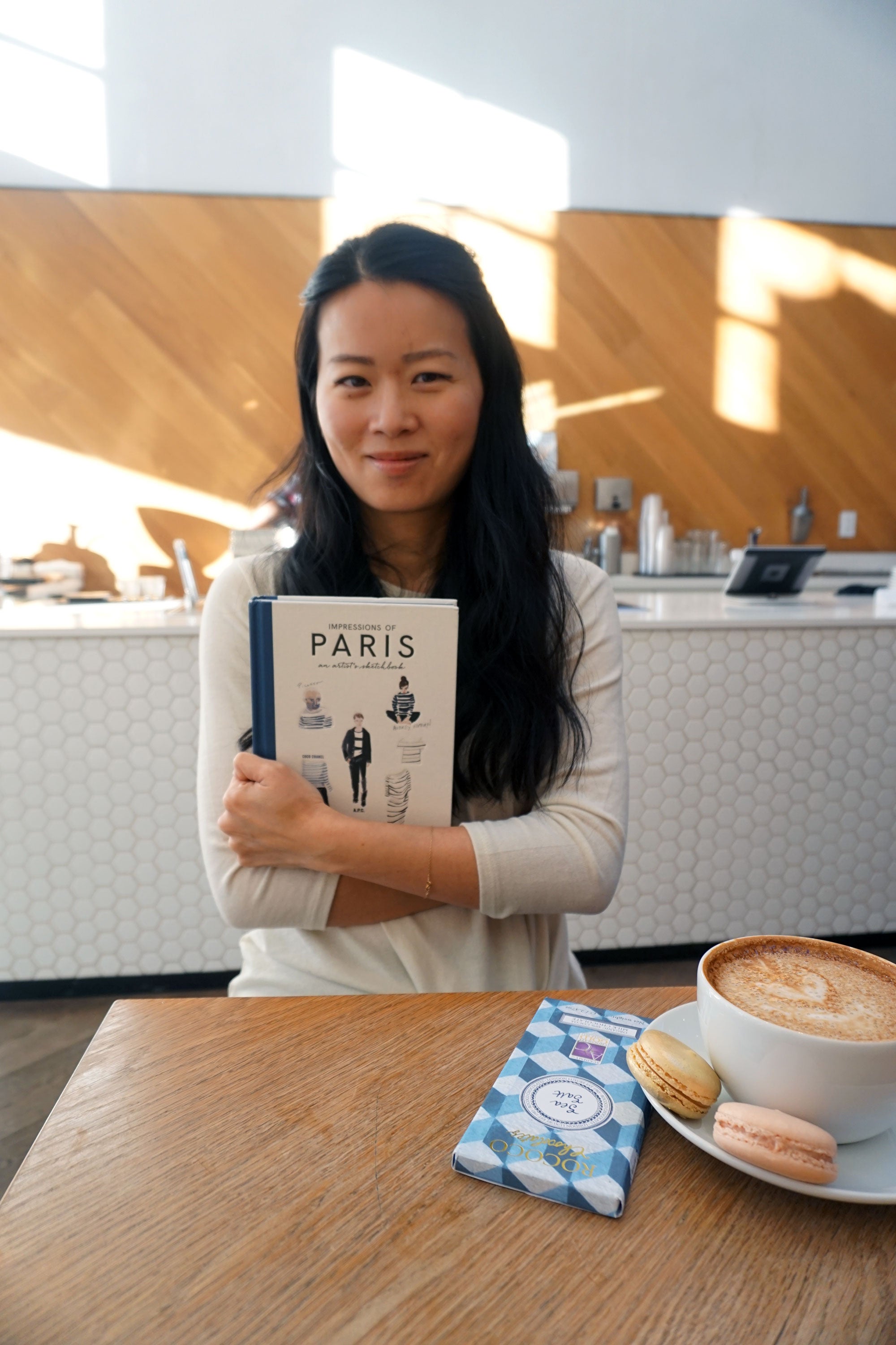
Images courtesy of Cat Seto.
Find out more about Seto’s work at catseto.com.